Click here to get back to main
PUBLICATIONS page
BIO:
Anthony
Palmieri
founded Palmieri Concepts after
20 years of creating custom artwork for his own pleasure and
enjoyment along with 30 years as a car enthusiast. This business
initially grew out of a love for motor vehicles and was started
to share with others what began as a hobby. After taking his
own pride and joys (yes this really started with family pictures
and not cars) and combining them with creativity, it became
obvious that many others would like to showcase their loves
as he has done.
His first
experience was with a 1967 Mustang convertible that he restored
from top to bottom in 1977. He had never done a restoration
before so there were many mistakes made along the way. Now
30 years later, he has learned many more things and wants
to share them. On the artistic side, it appears that his artistic
ability to work with cars first surfaced around 4 years old,
when he carefully used a large paint brush and white house
paint to customize his grandfathers blue car. Since then,
he has improved his technique! In addition to the custom artwork,
he has also written numerous articles on automotive art and
car shows, covering topics from custom show boards, to automotive
theme garages. Links to some of these articles can be found
on www.PalmieriConcepts.com web page. His goal was to create
a business where each and every one of his works of art are
custom done just for you with the intention that they would
be something that he would display on his own walls. Many
of the custom pictures that he has created can be seen displayed
at his home.

The
pictures displayed on this web site are LOW Resolution. The
final product (pictures, or source files) are photographic quality.
Sales@PalmieriConcepts.com
Copyright
2005-2007 by Palmieri Concepts. All rights reserved. Protected
under both U.S. Federal copyright law and international treaties.
No part of this site, including text, images and computer code,
may be reproduced or copied in any form or by any means, electronic,
graphic, digital or mechanical, including photocopying or information
storage & retrieval systems, without the express prior written
permission of Palmieri Concepts. The only area that may be reproduced
are the publications that expressly state that they can be copied.
They must be used in their entirety without any changes, and
provide a reference to www.PalmieriConcepts.com, and credit
the author.
-
Classic Car Pictures and Art by Palmieri Concepts -


By: Anthony
P. Palmieri
March 13, 2007
Abstract:
In these days
of computers, the internet, digital cameras, and on-line publishing
companies, individuals can more easily express their creativity
through writing and publishing their own written works. Whether
it is a novel, a short story, or a how to guide, having a creative
cover is important to help capture the attention of your audience.
There is that old saying, "You can't tell a book by its cover"
is so true, but your job as an author is to make sure that the cover
best reflects your written works. With the growth of E-books and
on-line books, having a well designed cover is even more important.
The web surfer can quickly have tens if not hundreds of books at
their fingertips, but why should they select your book over another?
Without spending many dollars in marketing, one of the best tools
at your disposal is a cover that will get their attention and hopefully
pique their interest to make a purchase. If you are writing on a
topic that already has many similar topics, such as "Vegetable
Gardening", you have to compete even more for the consumers
dollars.
You could purchase
the different graphics tools of go off to a company to design your
cover for you. Most of the covers that you are familiar with in
a book store cost hundreds of dollars to design, and in some cases
thousands. Now whether you are writing 10 pages or 5000 pages, this
article will give you some basic ideas that will help you design
your next book cover into one that is different, unique and personal.
Remember that a well done book cover will boost your sales.
Designing
A Cover For Your Book
- A guide for self publishers -
You have already
expressed your creative side by writing a book, now lets express
your artistic side. By using a collection of clip art, or a low
cost digital camera coupled with some imagination can open the door
for you to create unique cover that portrays your writings. Even
with that saying, "You can't tell a book by its cover",
the cover definitely gets attention. Think of the book cover as
a marketing tool that promotes not only your book, but you as the
author.
Software packages
like Adobe Photoshop and Illustrator have many capabilities that
allow you to customize your pictures and illustrations. The question
often asked is; "What should I do?" The intent of this
article is to give you a few ideas to spark your creativity and
see what fits your personality. Our focus at www.PalmieriConcepts.com
has been on pet and automotive art, so we will use an automotive
car show judging guide as an example, although these ideas can be
applied to many other topics.
With E-Books
and on-line publications, having an elaborate cover is a one time
upfront cost since there is no printing involved, so it is worth
it to do it right since the book revenue in part will be dependent
upon the cover.
Publishers
for hard copied books have the ability to use different papers,
and cover media such as foil, and other eye catching materials.
On-line publishing has to leverage the graphics appeal to grab the
readers eye and entice them to read further. A brief list of tips
to consider when designing your book cover is as follows:
1. Always try
to use high resolution images (clear and crisp) for any initial
artwork. You can always lower the resolution later on.
2. As an author, if you expect to have multiple books you may wish
to have a common theme where there may be a similar layout or border
between books. Define your own brand identity.
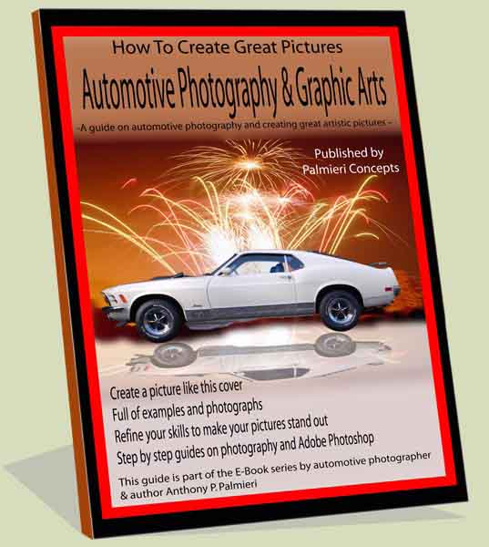
3. Design your a layout with layers giving a three dimensional effect.
For example the palm tree in the background of the "Pet Photography
Book Example".
4. Some customers will also print out their book, so you want a
design that is printable, and will still look good. Make sure that
what ever resolution you use is sufficient for printing. Typically
150 DPI will work unless there is intricate details that may require
higher resolution.
5. For best versatility and color representation use RGB color specifications
versus CMYK.
6. Hard copied books use different cover effects to catch the readers
eyes, such as fabrics, and embossing. You want to obtain a similar
visual effect, so use different background textures to give a feel
like cloth, diamond plate, fabric with out them being too pronounced.
Select something that relates to the content. One example we used
was a diamond plate border for an automotive engine book. The rugged
diamond plate linked nicely to the bold metal engines.
7. Remember your target audience. If it is children, select clip
art that they can relate to. For hobbyist, try to incorporate some
aspect of the hobby on the cover.
8. Do not clutter the cover too much with images or text. It can
make it difficult to read on line.
Use visual effects that reflect the contents and the value it brings
to the reader. A consumer is more likely to purchase a book f they
perceive the value more than the cost. Your cover needs to reflect
the value, but it is equally important that the contents justify
the cover. Do not mislead the reader. The judging book example has
a trophy in the background implying if you follow the advice in
the book, you could have a trophy on your shelf. Or the pet photography
example where it tells he reader it will help them create a picture
like the one on the cover. These are things that have a tangible
feel to them that reflects value. Many of the books we sold were
purchased as a gift. The giver wants to make the receiver happy,
and wants confirmation that it's a great gift and often looks for
a smile. When someone sees your cover you want them to smile.
This value
in a cover that gets attention is dependent upon how well the design
is done, and what message it gets across.
Marketing studies
have show that having a catchy box or cover for a product sells
more products, so take the ideas presented here and sell some books.
7. Final Remarks On Designing Your Book Cover
Even though
we are only presetting a few examples and ideas, you should realize
that like the words you have written on the pages, the book cover
is an extension of the writers personality. As long as basic principles
are adhered to, there is no right or wrong way, as long as the message
gets across. Accurate representation of the books contents along
with a cover that is memorable are two of the keys to make your
book stand out.
Competition
for consumers will continue to increase as more titles compete with
yours. Look at what other authors have done and open your imagination
and embark on the first step to create yours. By utilizing the tips
here you are one step closer.
So to get started,
take what you have learned here, finish your book and get a cover
designed.
For additional
information on how to designing book covers or having a custom cover
designed for you, visit Palmieri Concepts at www.PalmieriConcepts.com.
There are many examples that have helped authors like you have a
great cover.
For additional
information on other book covers click HERE.


